
Aspen Dental
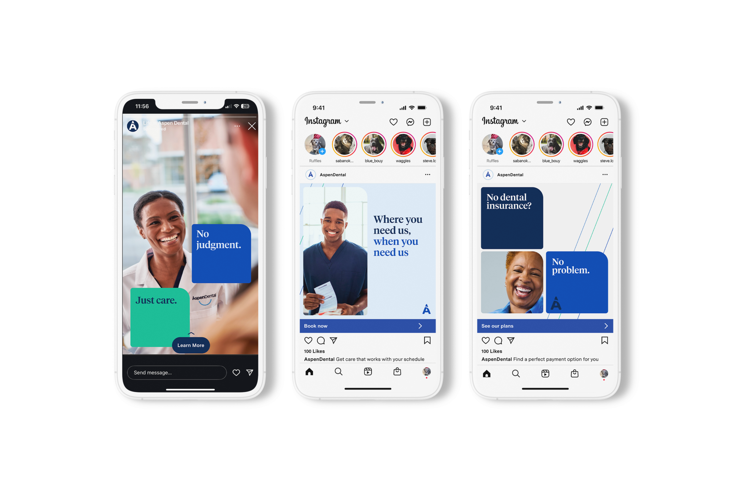
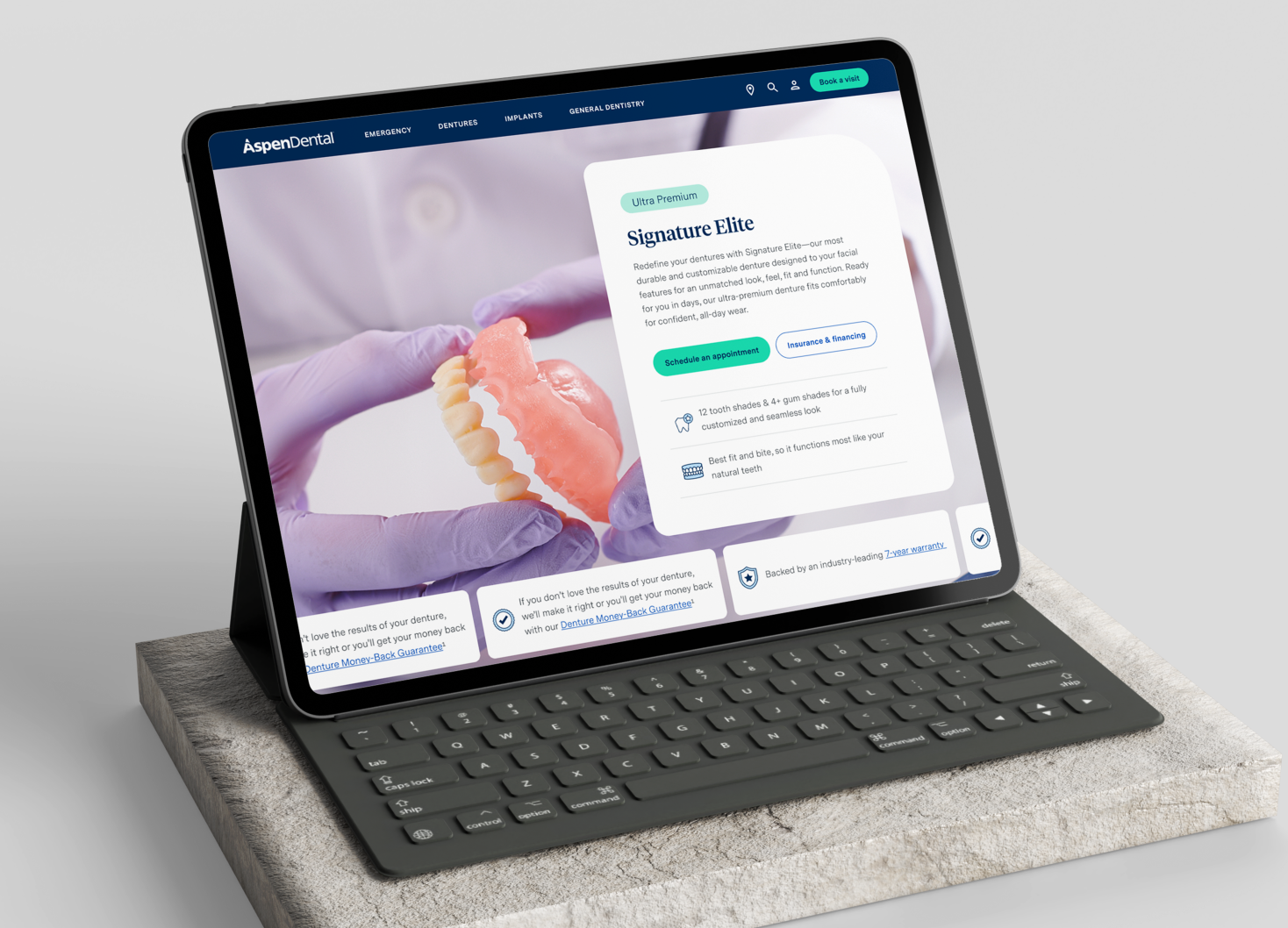
Aspen Dental came to Chalk looking to modernize their existing brand and stand out in the on-demand dental space. Keeping existing elements such as their iconography and colors, we looked for ways to bring new intrigue to the brand, with a focus on digital spaces.
Key elements we created:
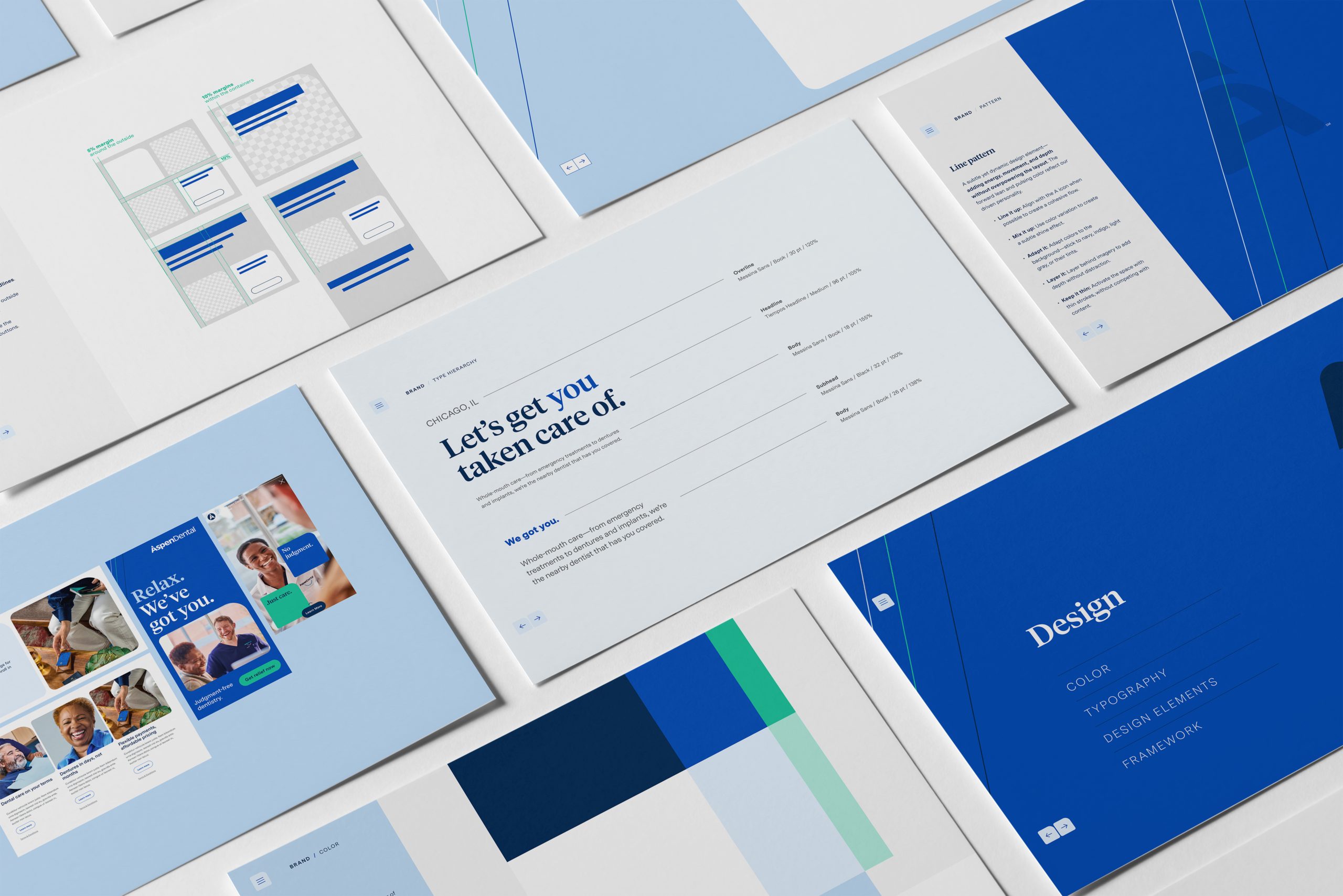
Grid system: We created a flexible container using rounded corners modeled off the "D" in Aspen Dental. These containers created a rich grid system. They could be used to draw emphasis on text over images, or used as image containers themselves. This provided Aspen Dental with much needed visual structure that the original brand had lacked, and was completely own-able compared to competing brands.
Line pattern: A fun way to add more visual interest to solid color floods, this pattern was rooted in the type anatomy of the Aspen signature "A" icon. While simple in nature, it added another layer of excitement to the brand that was previously lacking before.
Typography guidance: We leveraged a new strategy for how Aspen could use combinations of their signature typefaces, Tiempos Headline and Messina Sans. This created a unified system rooted in hierarchy for use across all channels, adding to their distinguishing features.
With Aspen having a large organization of stakeholders, leadership, and internal creatives, it took many iterations to reach a successful outcome. In the end, we were pleased to reach a comprehensive brand that everyone could take pride in.