PartSelect
Art Direction | Figma | Adobe Indesign | AI Image Tools
"Don't change the logo."
We started this adventure with PartSelect with only one baseline: their logo. They needed a brand, and in a sea of blue-and-white competitors, we had a unique opportunity to completely set them apart from all other major home appliance parts distributors.
We pulled together two unique positions:
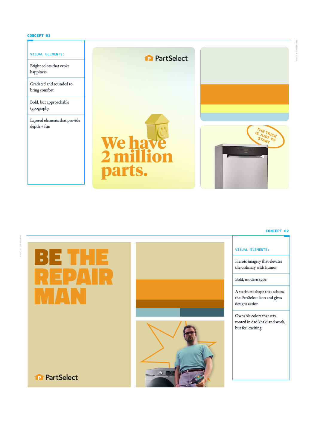
01: The happy, bright vibe. Meant to be approachable with just a touch of modernity, this brand would feel like an encouraging hug from your dad, ensuring the customer that they had the support they needed to make their own home appliance repairs.
02: The bold, heroic position. Rooted in the colors of hard work, this brand would pose the customer as the action hero of their home, ready to make their own repairs with PartSelect as their trusty sidekick.
With key stakeholders showing love for the positioning of concept 2 but also the colors of concept 1, we said: Game on.
But how do we bring true action hero vibes to a home appliance parts brand?
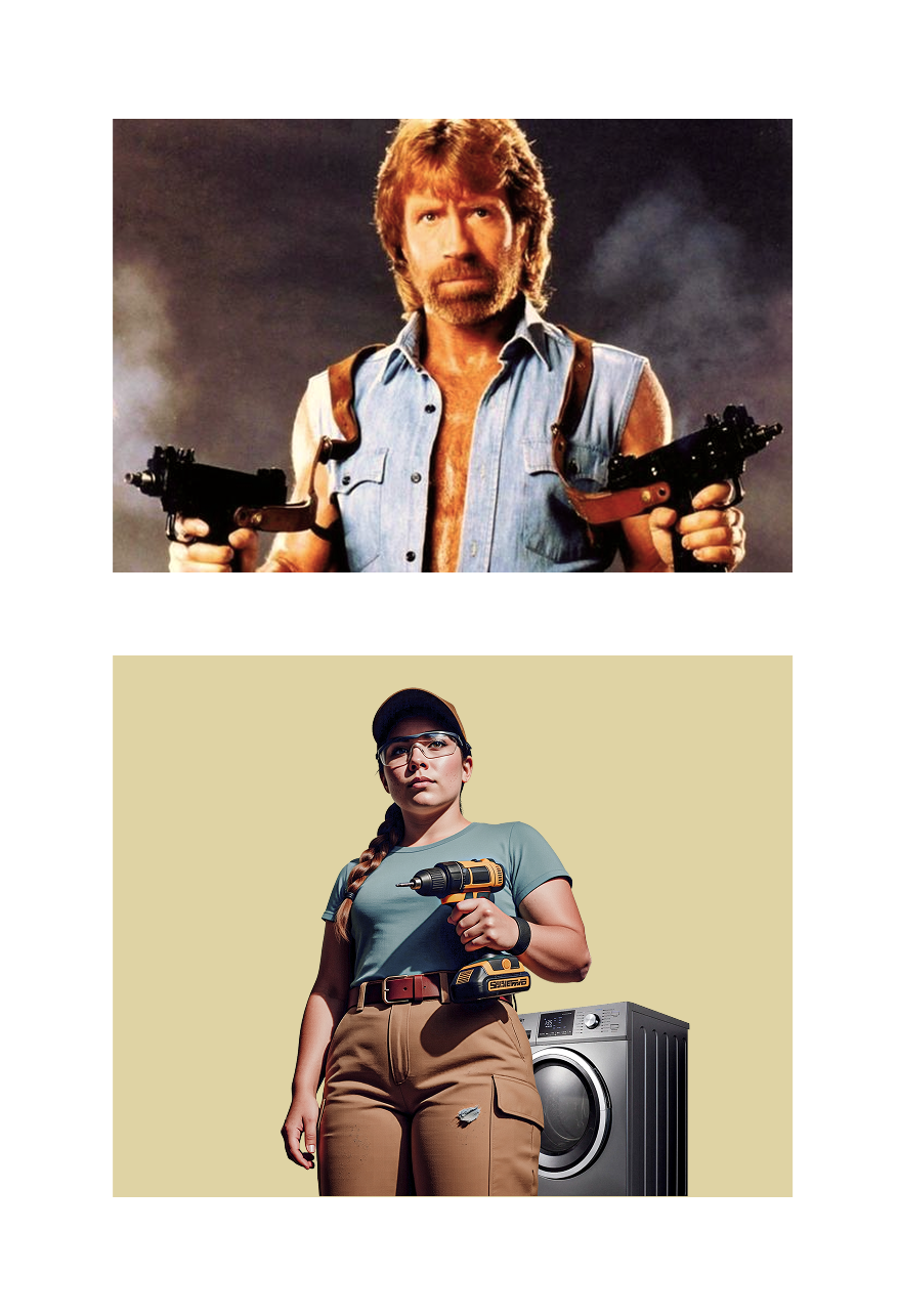
Bring on Chuck Norris.
Just kidding, we didn't have the budget for Chuck. But Chuck put us in the right headspace: to make this direction successful, we needed to bring the action movie aesthetic to the target PartSelect audience. But how do we embody that aesthetic in your average homeowner?
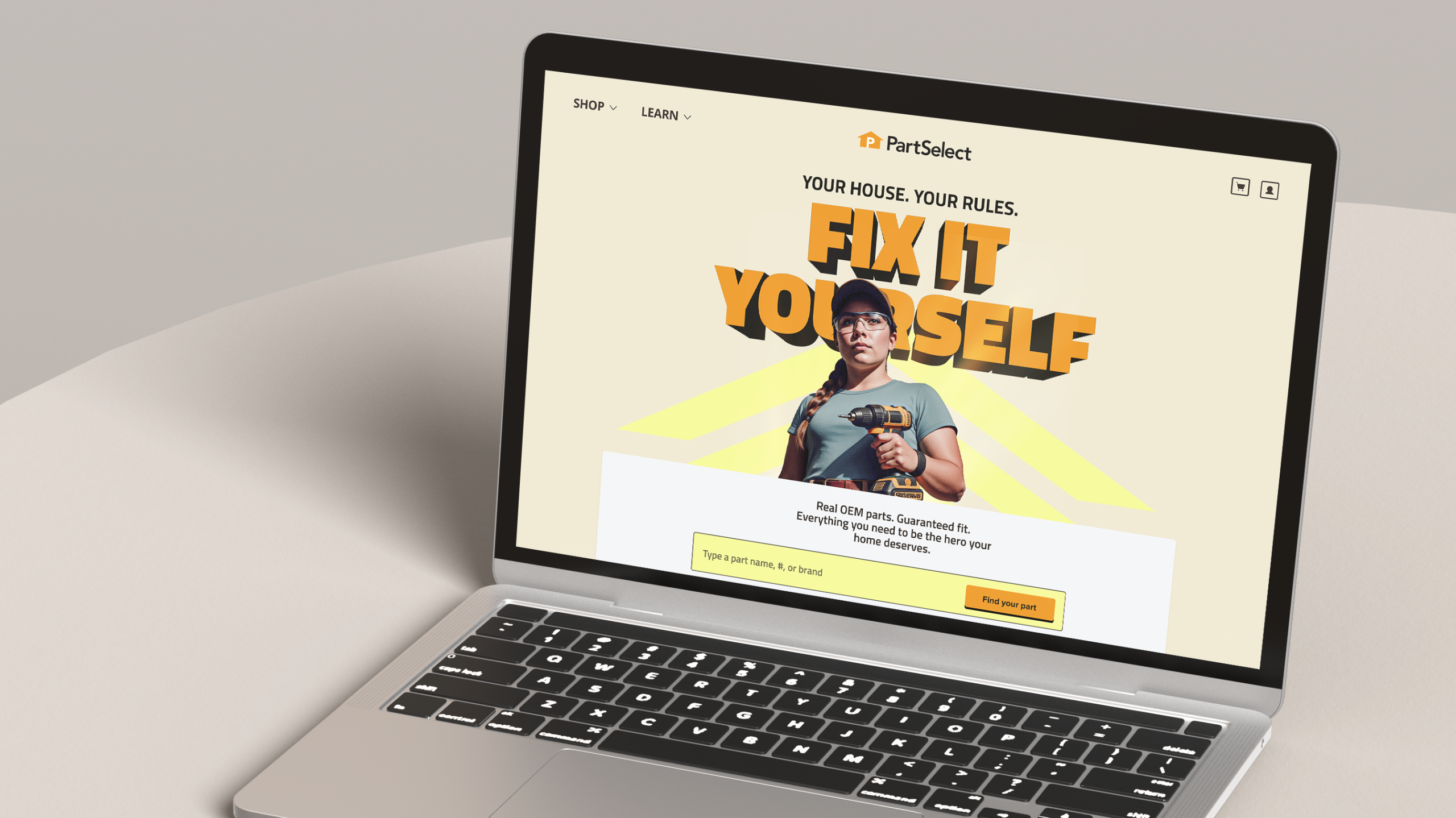
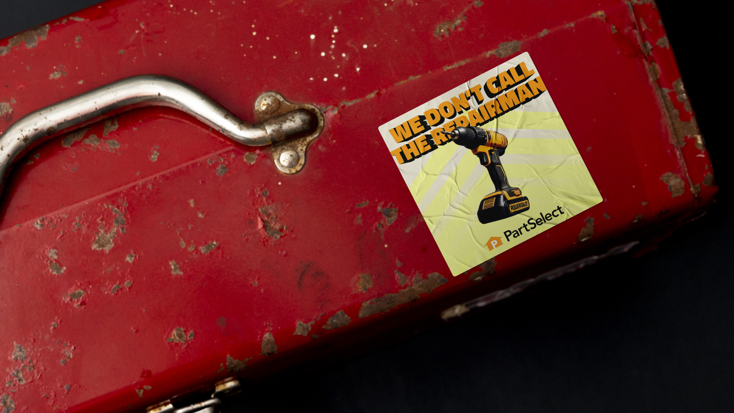
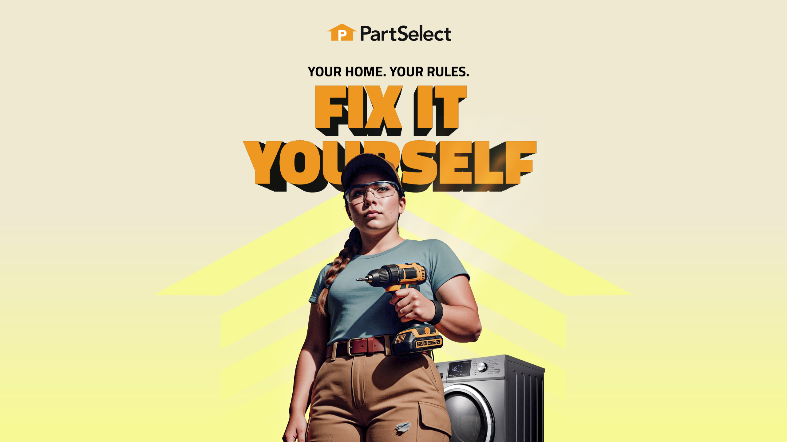
The answer: dad vibes. I thought immediately of an action movie sequence, but it's just an ordinary person suiting up in their home repair best; khaki cargo shorts, tool belts, safety glasses, ready to take on the foe that is their broken appliance.
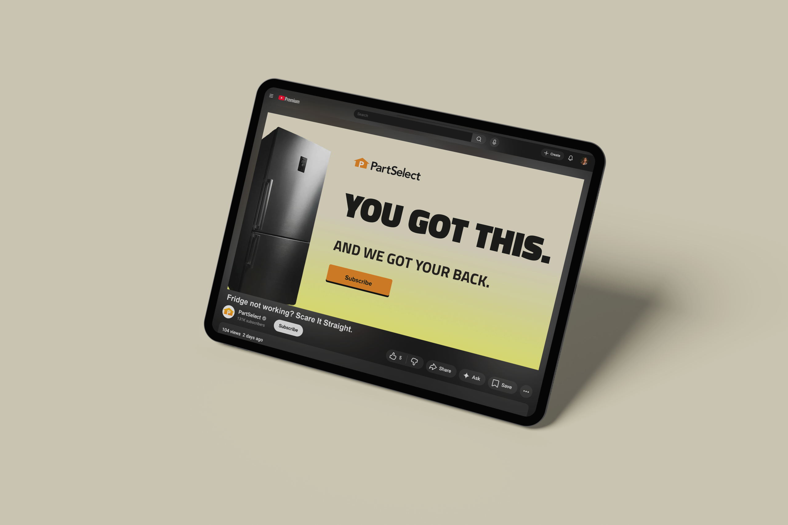
With a shoestring budget, I did not have the resources for a photoshoot. Instead, I leveraged the power of AI tools. Using a combination of Chat GPT, Gemini, and Adobe Firefly I created our "mascot." She is the hero of her home, tactically equipped to take on anything, confident with a LFG (Let's f*cking go) attitude. In contrast to her, I styled her "foe," the broken home appliance, with a dark facade. Together, staged with low angle shots and dramatic lighting, we now had our story: Anyone can be the hero of their home, and PartSelect is here to help.
With our position firmly established, it was time for the real fun to being. As I fleshed out the rest of the brand, I wanted to make sure that the heroic POV could always be felt, even in the most mundane of situations like transactional emails. Leveraging bold 3D headlines that jump of the screen, bright gradients, and background elements based off the logo icon, I used systems of layered elements to make every composition feel like an action movie poster.
Once the system was successfully designed and enthusiastically approved by PartSelect, I closed out this project with a comprehensive style guide to help them communicate the new strategy to their internal creative teams. If you'd like to see all the nitty gritty details, you can view the style guide here.