
Encompass
Where we started.
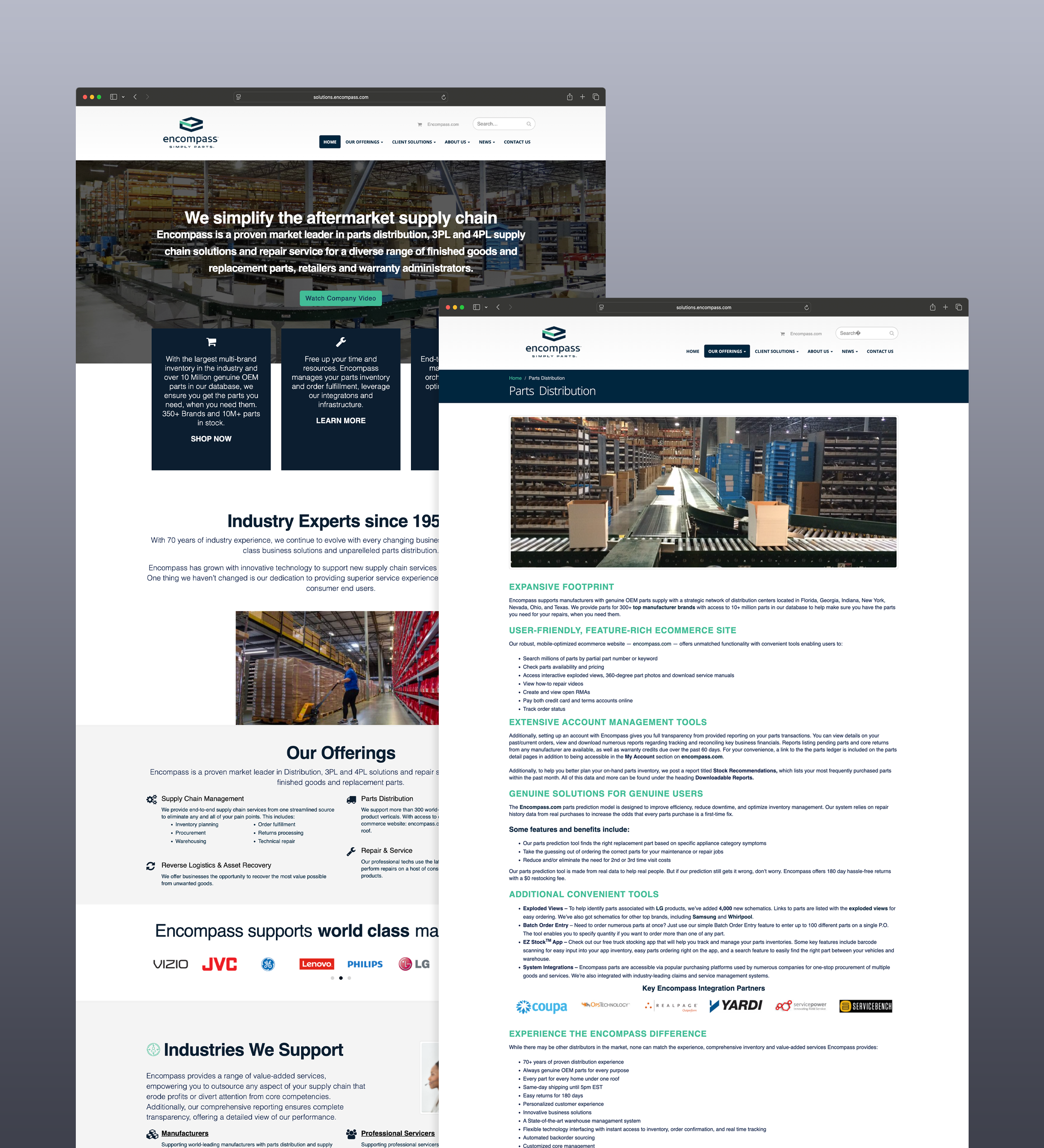
As Encompass began to leverage an updated brand system, they came to us with a problem: Encompass Solutions, the B2B sister site of Encompass Parts, needed an extreme overhaul. Sporting outdated UI elements, limited mobile access, and huge amounts of information in the form of text walls, the site poised us with an interesting question:
How do we take all this complex information, and make it clear, concise, and accessible?
Encompass brought many voices to the table: parent company stake holders, internal marketing teams, and department leads. Taking all voices into consideration, I sifted through information and worked with my copywriting team to trim the fat and gain a clear point-of-view: give the most direct information for each department, and funnel potential customers to reach out for more information, giving the sales teams their chance to make the pitch and convert them.
Where it went.
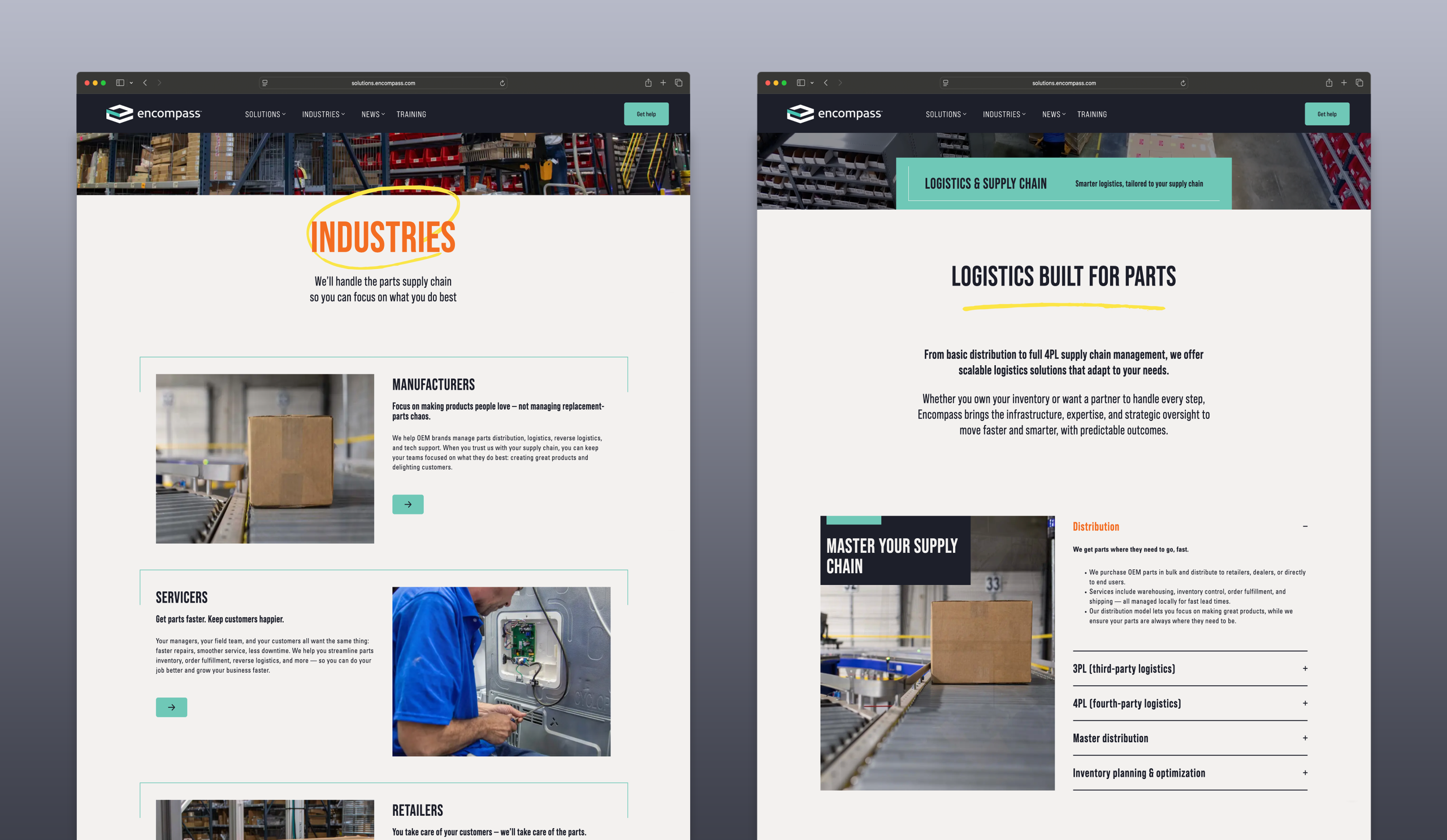
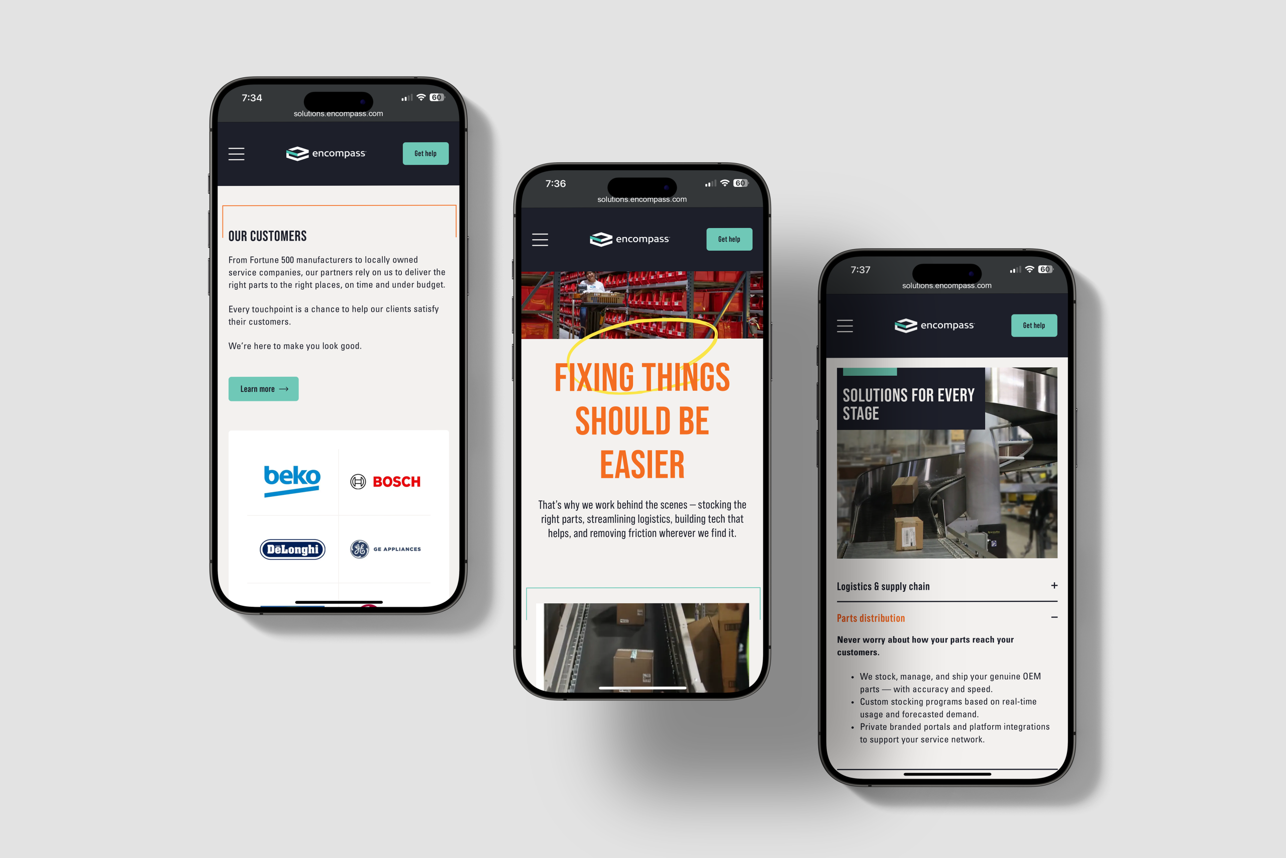
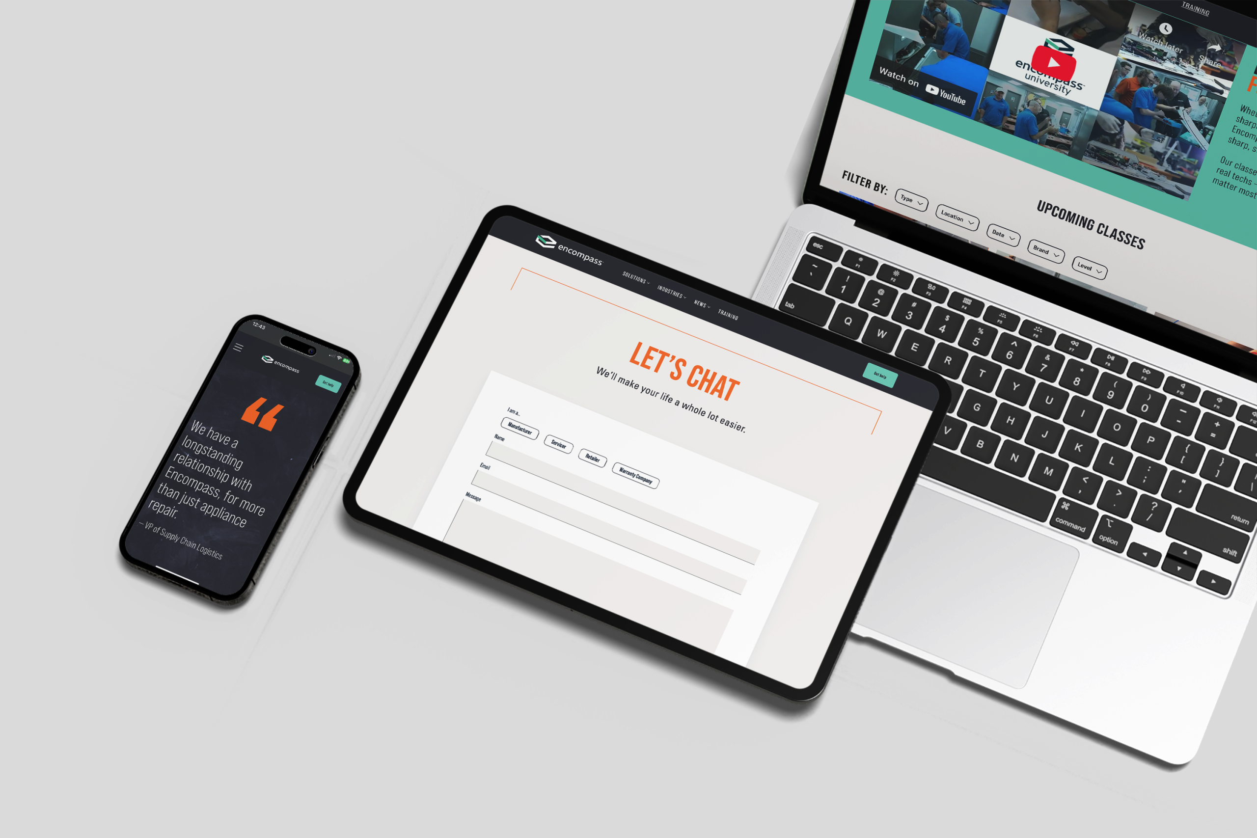
With a clear POV in mind, I began to categorize our rewritten site into a new structure, building a working prototype in Figma. Starting with the homepage, a catchy video header leads to clear direction for potential customers who know what they need, jumping them straight to second level pages to get them moving. For those who were less sure of their needs, we created clear Solutions/Industries "catch-all" pages to help potentials navigate to the information they were looking for. Each second level page provided the needed to provide the "meat" of the content, but how do we do that without flooding the page in text?
Enter: the content block. I designed flexible "blocks" to keep information organized and support proper hierarchy, while still giving the client easy access to update things as needed. With 25 different content styles, from humble accordions to eye catching banners, I was able to reduce the visual clutter of the text walls and clearly communicate important information to potential customers. And then the fun part, I brought the brand to life through background textures, pops of brand colors Safety (orange) and Spark (yellow), and surprise hand-drawn elements behind important elements.
With full approval from the broad Encompass team, I worked directly with our web developers to move the Figma protoype into Wordpress, provided them with guidance as the process proceeded. No detail was spared; I ensured that every text style was correct down to the smallest tracking details and every animation was paced perfectly. When we finished our quality assurance phase, the site went to each department head for final sign-off and then went live. You can get the full experience of the live site here.